#03 . E-Commerce, Responsive Web Redesign
#03 .
E-Commerce, Responsive Web Redesign
Project: Responsive Website Redesign
Role: Product and Ux/Ui Designer
Timeline: 2 weeks
Team Members: 3 Ux/Ui Designers (Eva, Batol and myself)
Tools: Figma, Figjam
Project: Responsive Website Redesign
Role: Product and Ux/Ui Designer
Timeline: 2 weeks
Team Members: 3 Ux/Ui Designers (Eva, Batol and myself)
Tools: Figma, Figjam
Project: Responsive Website Redesign
Role: Product and Ux/Ui Designer
Timeline: 2 weeks
Team Members: 3 Ux/Ui Designers (Eva, Batol and myself)
Tools: Figma, Figjam
Introduction
Introduction
In this case study, we will explore the journey of redesigning the website for “Condesa — Community Cracks”, a digital marketing agency. The project aimed to improve the user experience and address pain points identified through research and analysis. The stakeholder had an hypothesis: The UI was not updated, which lead to less conversion. To prove if this was right ot wrong, we included some questions related to that on the interviews. The redesign process followed the Design Thinking methodology, based on the double diamond: Discover, Define, Develop and Deliver.
In this case study, we will explore the journey of redesigning the website for “Condesa — Community Cracks”, a digital marketing agency. The project aimed to improve the user experience and address pain points identified through research and analysis. The stakeholder had an hypothesis: The UI was not updated, which lead to less conversion. To prove if this was right ot wrong, we included some questions related to that on the interviews. The redesign process followed the Design Thinking methodology, based on the double diamond: Discover, Define, Develop and Deliver.
In this case study, we will explore the journey of redesigning the website for “Condesa — Community Cracks”, a digital marketing agency. The project aimed to improve the user experience and address pain points identified through research and analysis. The stakeholder had an hypothesis: The UI was not updated, which lead to less conversion. To prove if this was right ot wrong, we included some questions related to that on the interviews. The redesign process followed the Design Thinking methodology, based on the double diamond: Discover, Define, Develop and Deliver.
Discover, Empathize & Research
Discover, Empathize & Research
The project centered around Condesa, a Digital Marketing Agency catering to small and medium-sized businesses. We conducted secondary research to comprehend the market and identify potential competitors. The founder's hypothesis that the outdated UI was driving clients away was something we had anticipated, but it was confirmed during the meeting that user interviews were necessary to validate it.
The project centered around Condesa, a Digital Marketing Agency catering to small and medium-sized businesses. We conducted secondary research to comprehend the market and identify potential competitors. The founder's hypothesis that the outdated UI was driving clients away was something we had anticipated, but it was confirmed during the meeting that user interviews were necessary to validate it.
The project centered around Condesa, a Digital Marketing Agency catering to small and medium-sized businesses. We conducted secondary research to comprehend the market and identify potential competitors. The founder's hypothesis that the outdated UI was driving clients away was something we had anticipated, but it was confirmed during the meeting that user interviews were necessary to validate it.
Interviews Info
Interviews Info
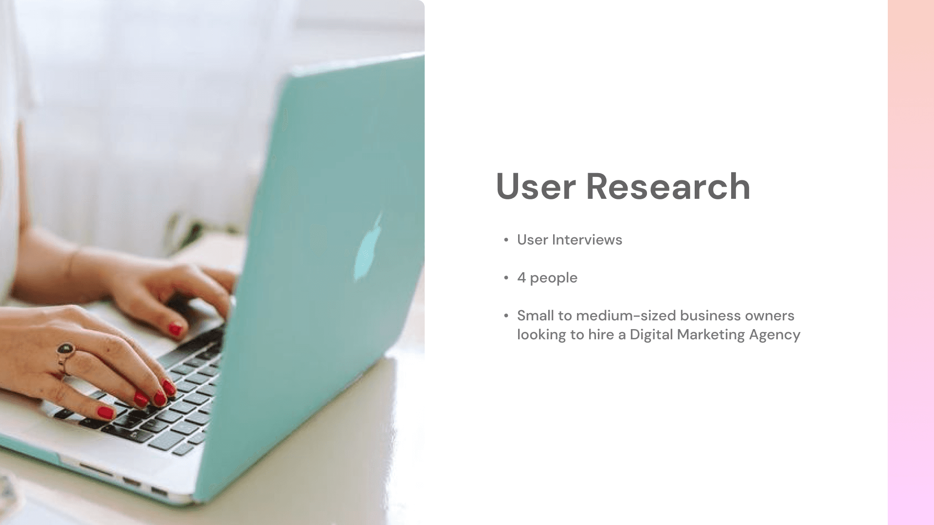
In the qualitative research phase, we conducted user interviews with 4 small to medium-sized business owners seeking a Digital Marketing Agency. Through the Affinity Diagram method, we organized key insights:
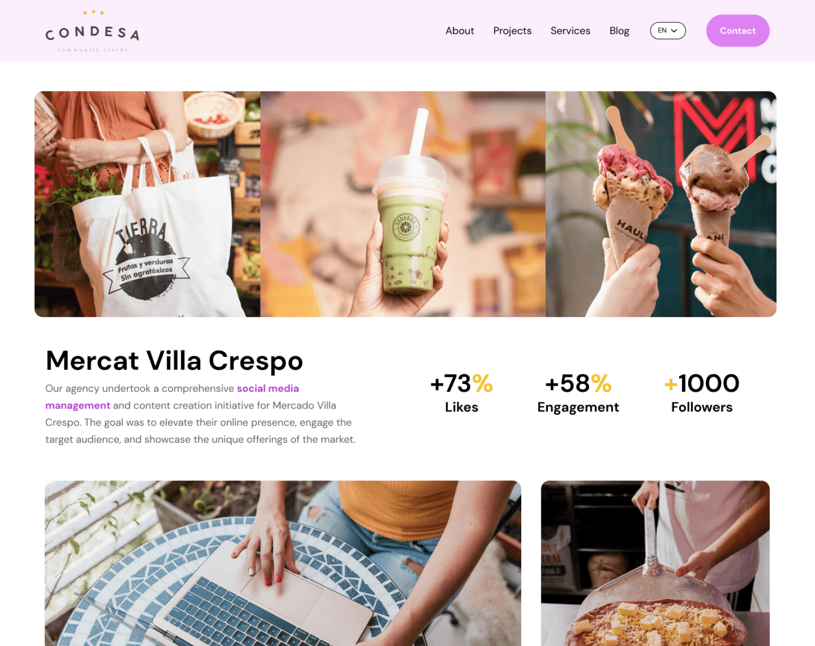
Projects section to explore the agency's previous work, which significantly influences their decision-making process.
A Services section with detailed information was highlighted by users.
A strong UI, as it enhances trust and credibility. This was considered a crucial factor in the decision-making process.
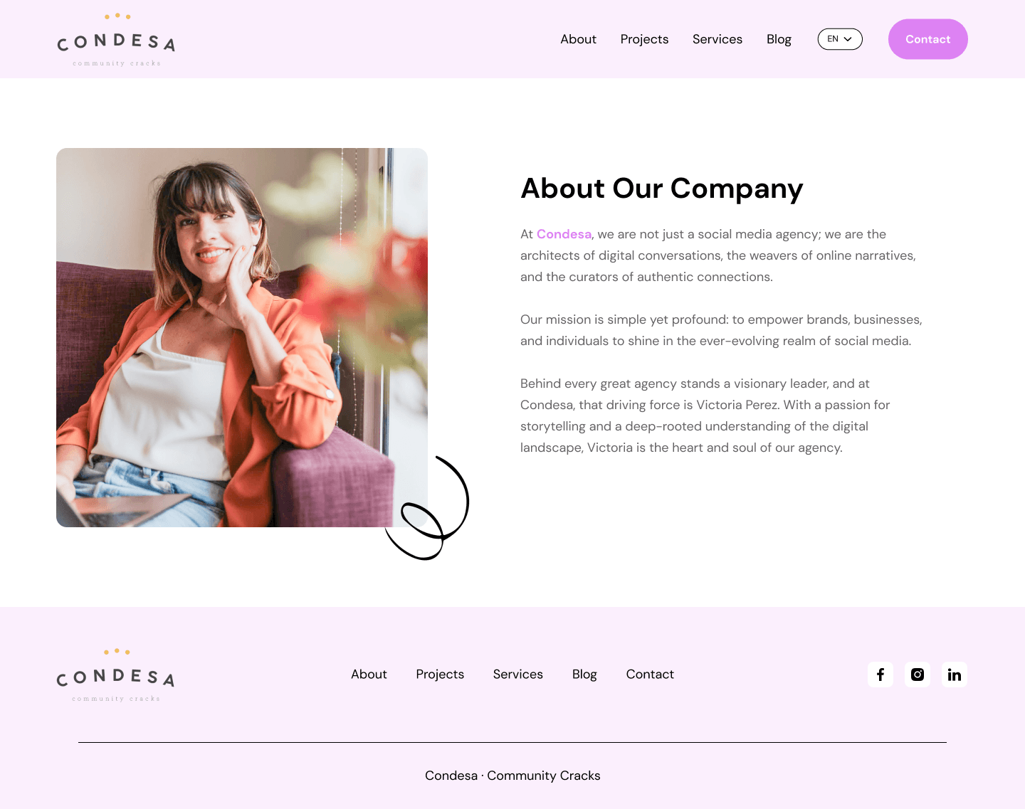
The "About Us" section was recognized as essential to understand the company's values, establishing an emotional connection that impacts their decision.
The "Contact Us" section was also important, with a focus on clarity, readability, user-friendliness, and seamless communication.
In the qualitative research phase, we conducted user interviews with 4 small to medium-sized business owners seeking a Digital Marketing Agency. Through the Affinity Diagram method, we organized key insights:
Projects section to explore the agency's previous work, which significantly influences their decision-making process.
A Services section with detailed information was highlighted by users.
A strong UI, as it enhances trust and credibility. This was considered a crucial factor in the decision-making process.
The "About Us" section was recognized as essential to understand the company's values, establishing an emotional connection that impacts their decision.
The "Contact Us" section was also important, with a focus on clarity, readability, user-friendliness, and seamless communication.
Define
Define
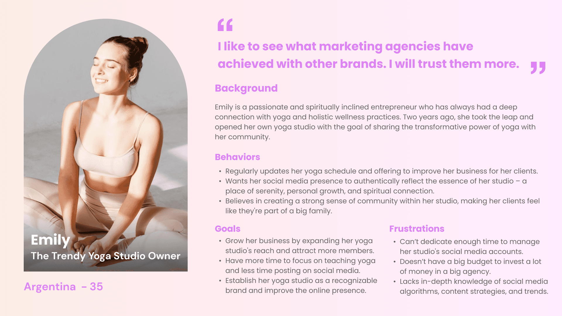
Combining our finding during the Secondary Research, the Competitive Analysis, the Stakeholder Interview and the User Interviews, we were able to have a clear understading about our target. This guided us in constructing the User Persona: Emily.
Combining our finding during the Secondary Research, the Competitive Analysis, the Stakeholder Interview and the User Interviews, we were able to have a clear understading about our target. This guided us in constructing the User Persona: Emily.
Combining our finding during the Secondary Research, the Competitive Analysis, the Stakeholder Interview and the User Interviews, we were able to have a clear understading about our target. This guided us in constructing the User Persona: Emily.
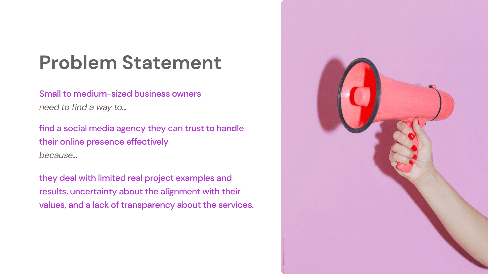
Although the user´s challenges were clear, we had some issues formulating a clear Problem Statement. It evolved from discussions within the team and valuable feedback from design critique and stand-up sessions with colleagues.
As a team, we recognize the importance of a robust Problem Statement, as it is the foundation for proposing solutions. This is why we iterate and discuss about it as much as possible.
Develop & Ideation
Develop & Ideation
With a refined problem statement, the team entered the ideation phase using the CRAZY 8's technique. We then used the MoSCoW method to decide the MUST HAVE:
“About Us” Section: to share the agency’s values and introducing the team behind the business.
“Projects” Section: showing client work and highlighting the resulting business impact.
“Services” Section: Keeping the existing one but expanding it to provide more details about what’s exactly included.
“Contact” Button available and contact options, to make it easier for users to get in touch and to increase the convertion.
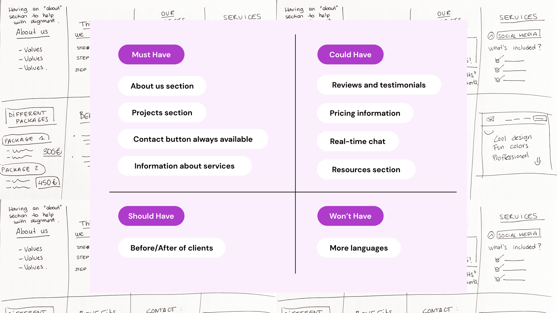
Ideation and Feature Priortization Process
Ideation and Feature Priortization Process
Deliver
Deliver
In this phase, we started with a sitemap to establish the website's structure and ensure a seamless user experience. The original sitemap outlined basic sections like Homepage, Services, Blog, and Contact Us, although it lacked dedicated segments for Projects, comprehensive service details, and an About Us section.
In this phase, we started with a sitemap to establish the website's structure and ensure a seamless user experience. The original sitemap outlined basic sections like Homepage, Services, Blog, and Contact Us, although it lacked dedicated segments for Projects, comprehensive service details, and an About Us section.
In this phase, we started with a sitemap to establish the website's structure and ensure a seamless user experience. The original sitemap outlined basic sections like Homepage, Services, Blog, and Contact Us, although it lacked dedicated segments for Projects, comprehensive service details, and an About Us section.
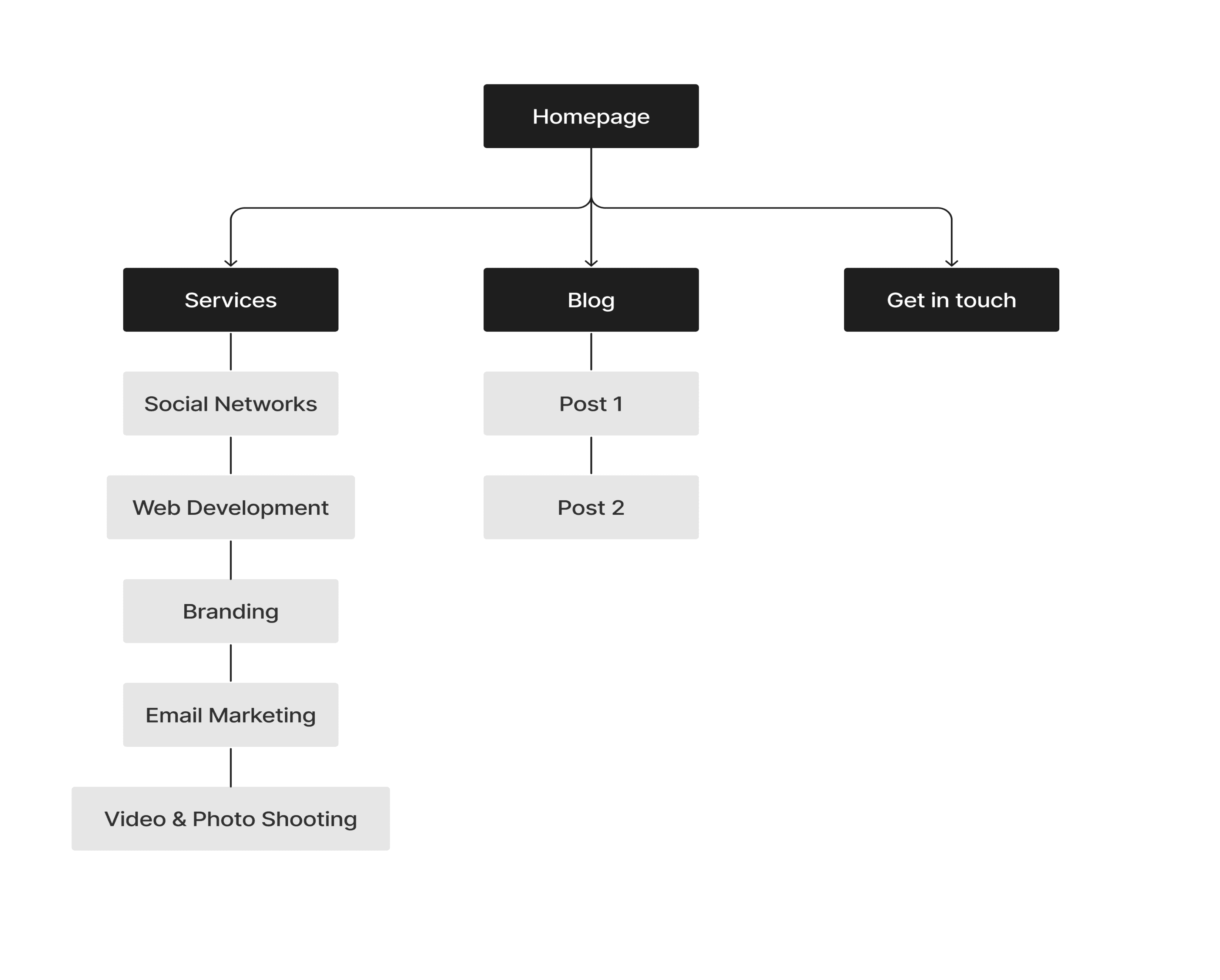
Old Sitemap
Old Sitemap
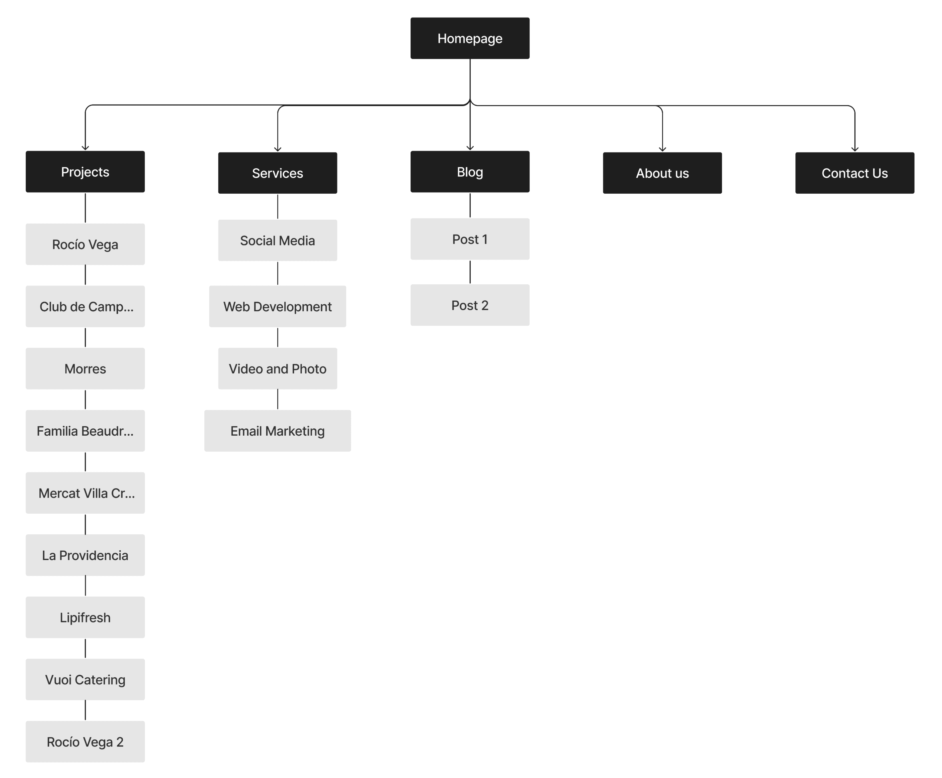
New Sitemap
New Sitemap
The user flow demonstrates how the user navigates through the website's sections, starting from Projects, moving to Services, checking the About section, and finally contacting the agency.
The user flow demonstrates how the user navigates through the website's sections, starting from Projects, moving to Services, checking the About section, and finally contacting the agency.
The user flow demonstrates how the user navigates through the website's sections, starting from Projects, moving to Services, checking the About section, and finally contacting the agency.
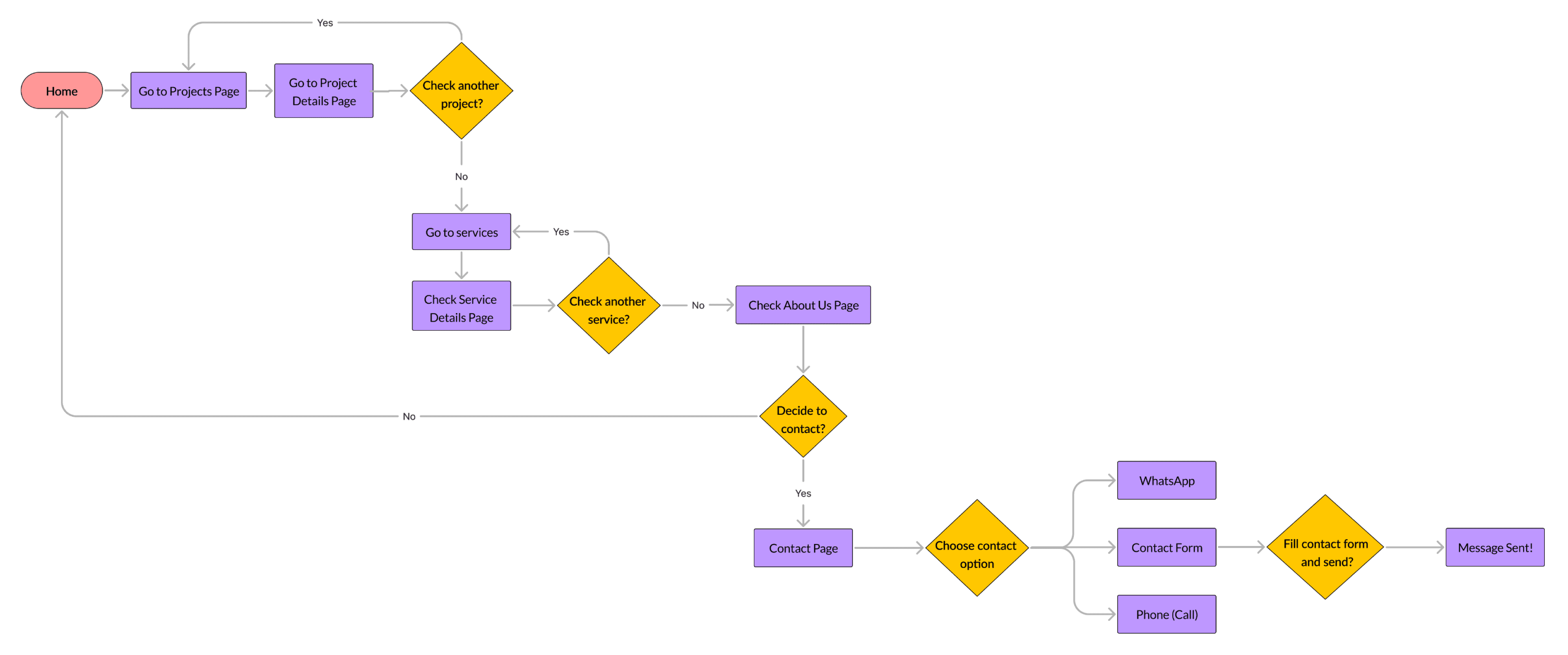
User Flow
User Flow
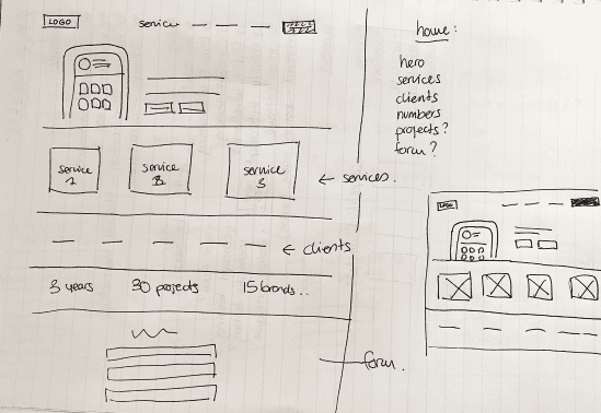
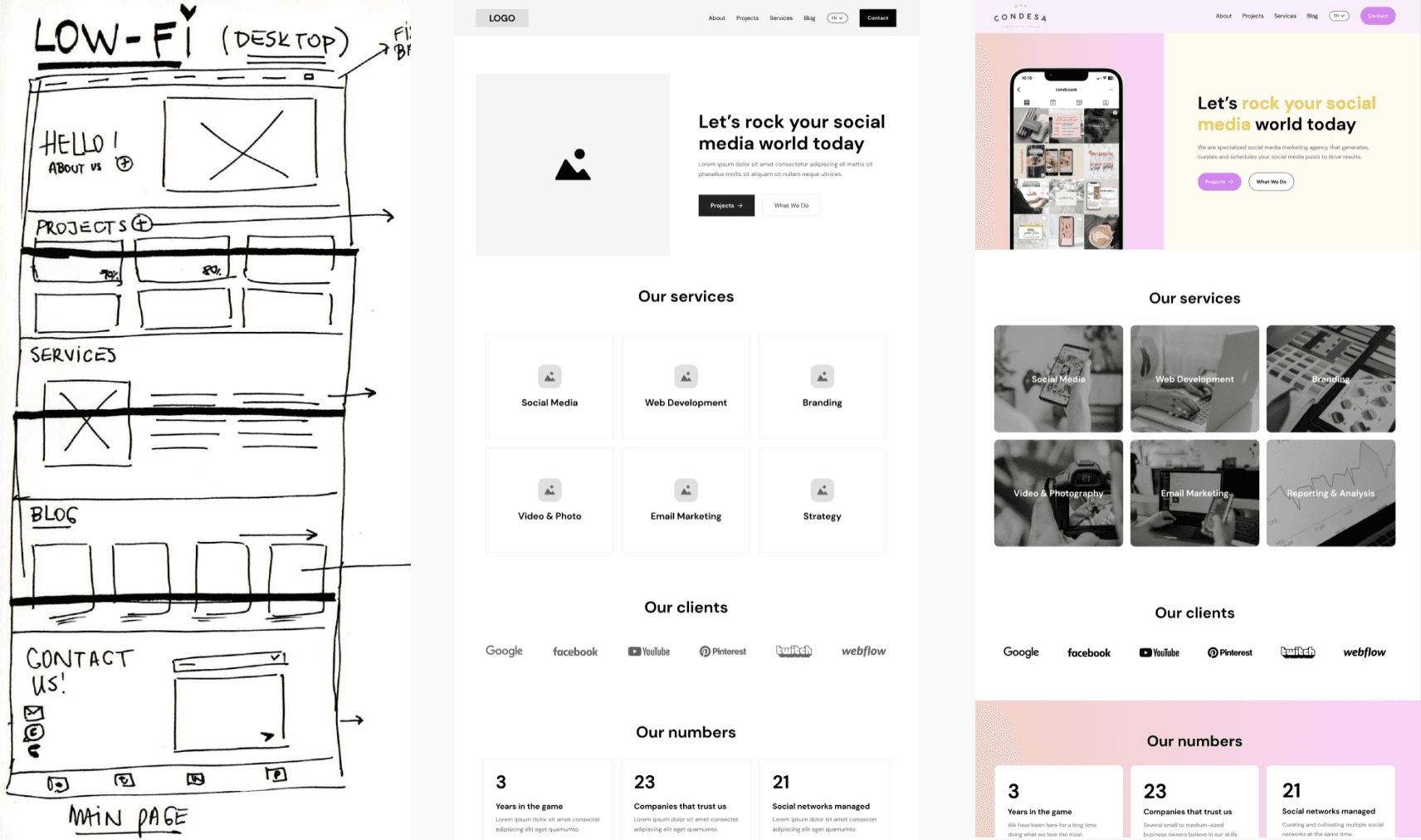
Low-Fidelity Designs
Low-Fidelity Designs
We’re moving into a crucial phase: turning our ideas into concrete designs, starting with the Low-Fi versions. Since we have diverse ideas within the team, each member worked on her own Low-Fi design. Later, we combined the best ideas as a team. This process has been fulfilling, even though it took more time, as it allowed each of us to be involved in every detail.
We’re moving into a crucial phase: turning our ideas into concrete designs, starting with the Low-Fi versions. Since we have diverse ideas within the team, each member worked on her own Low-Fi design. Later, we combined the best ideas as a team. This process has been fulfilling, even though it took more time, as it allowed each of us to be involved in every detail.
We’re moving into a crucial phase: turning our ideas into concrete designs, starting with the Low-Fi versions. Since we have diverse ideas within the team, each member worked on her own Low-Fi design. Later, we combined the best ideas as a team. This process has been fulfilling, even though it took more time, as it allowed each of us to be involved in every detail.
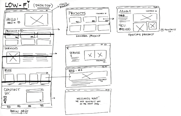
Low-Fi Sketches
Low-Fi Sketches
Low-Fi Digital Version
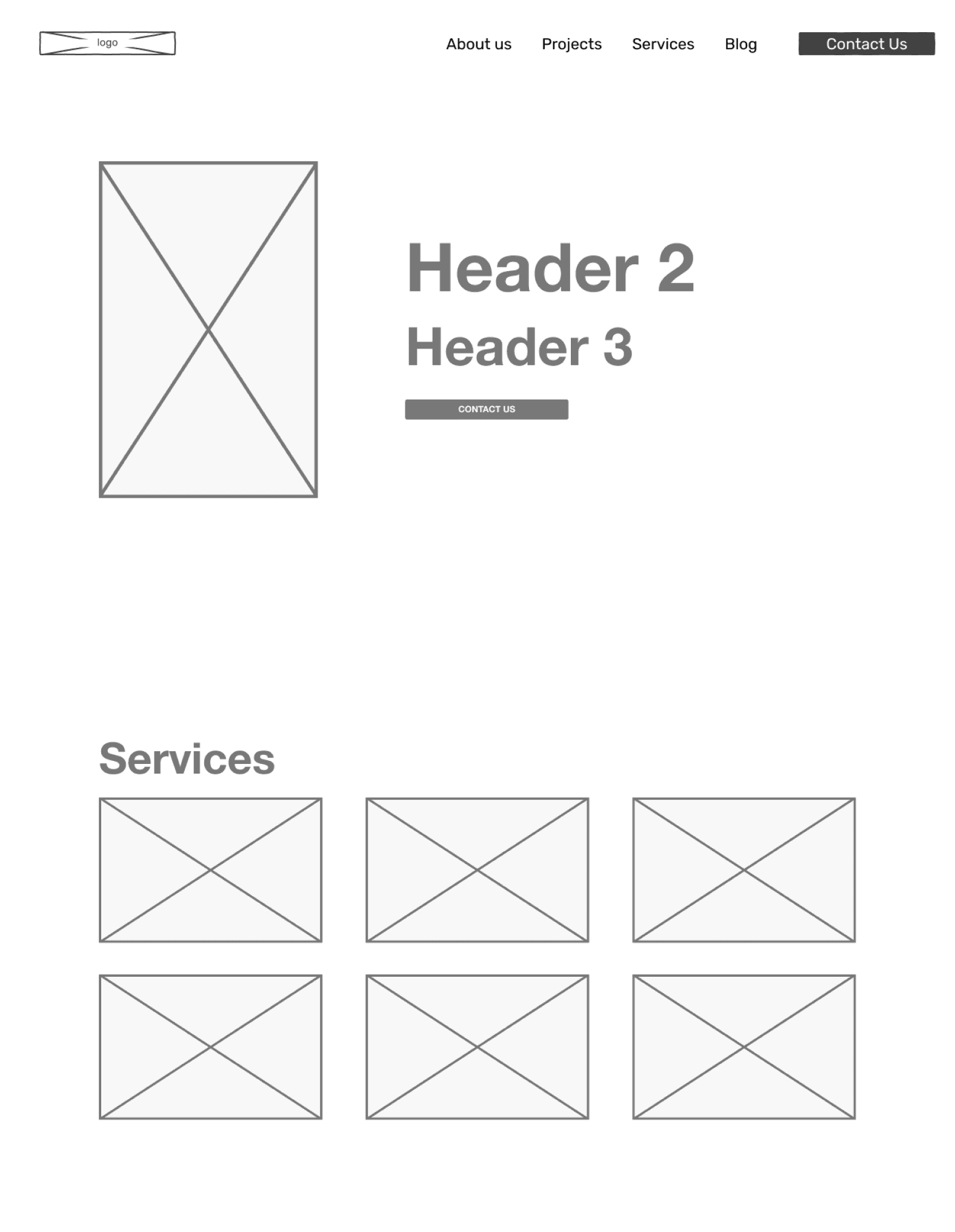
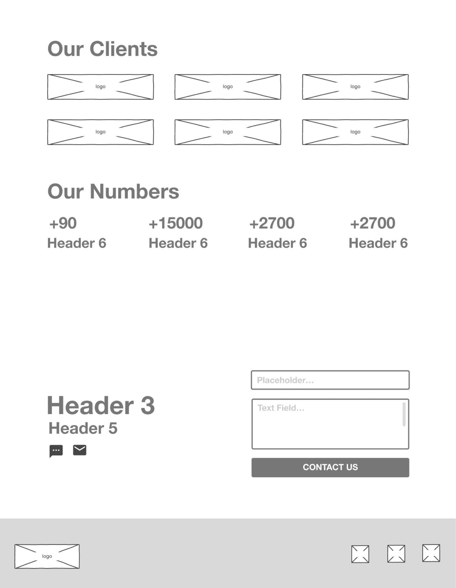
Mid-Fidelity & Usability Testing
Mid-Fidelity & Usability Testing
During the Mid-Fi design phase, we dedicated extensive time and effort to achieve a clear and refined design, prioritizing near-perfection. Recognizing the importance of a well-developed Mid-Fi design, we aimed to prepare thoroughly for the upcoming Usability testing.
During the Mid-Fi design phase, we dedicated extensive time and effort to achieve a clear and refined design, prioritizing near-perfection. Recognizing the importance of a well-developed Mid-Fi design, we aimed to prepare thoroughly for the upcoming Usability testing.
During the Mid-Fi design phase, we dedicated extensive time and effort to achieve a clear and refined design, prioritizing near-perfection. Recognizing the importance of a well-developed Mid-Fi design, we aimed to prepare thoroughly for the upcoming Usability testing.
Mid-Fi Designs
Can users use my web? We conducted Usability Testings with users to assess the functionality of our Mid-Fi prototype. With a focus on the "happy path," we ensured that essential elements were functioning smoothly. After testing the web with 3 users, we received predominantly positive feedback.
Main Feedback:
Clean and Minimalistic
Good Hierarchy
Easy to find contact options
Easy to Navigate
Branding, Moodboard and Style Tile
Branding, Moodboard and Style Tile
Of course, we conducted user testing on our moodboard and were delighted to confirm that a significant portion of our brand attributes were successfully perceived by the users. This validation provided the assurance we needed to proceed with defining Colors, Typography, and icons, creating the Style Tile, and the Design System, to finally start working on our final challenge: the High-Fi and the Prototype.
Of course, we conducted user testing on our moodboard and were delighted to confirm that a significant portion of our brand attributes were successfully perceived by the users. This validation provided the assurance we needed to proceed with defining Colors, Typography, and icons, creating the Style Tile, and the Design System, to finally start working on our final challenge: the High-Fi and the Prototype.
Of course, we conducted user testing on our moodboard and were delighted to confirm that a significant portion of our brand attributes were successfully perceived by the users. This validation provided the assurance we needed to proceed with defining Colors, Typography, and icons, creating the Style Tile, and the Design System, to finally start working on our final challenge: the High-Fi and the Prototype.
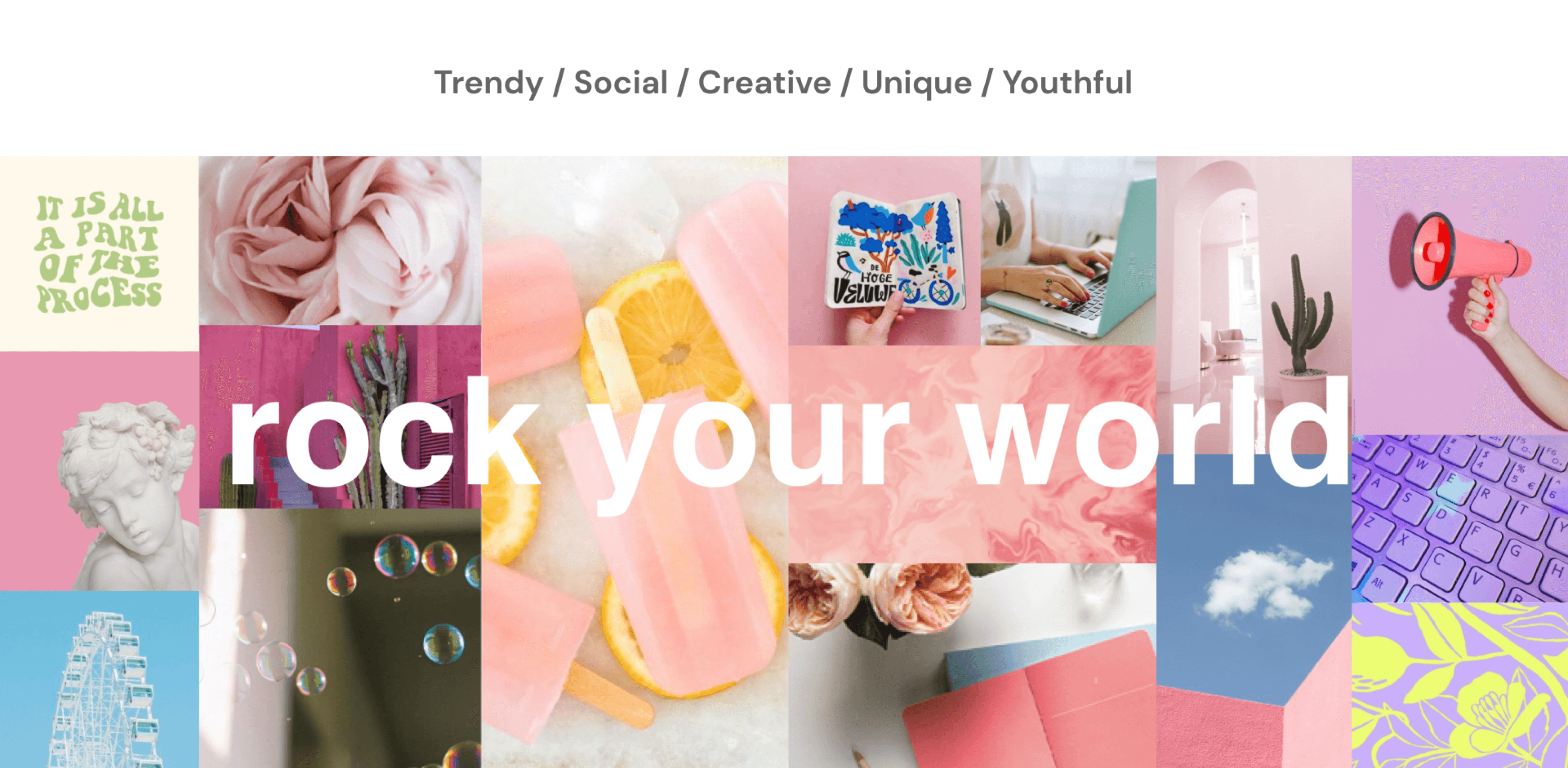
Moodboard and Brand Attributes
Moodboard and Brand Attributes
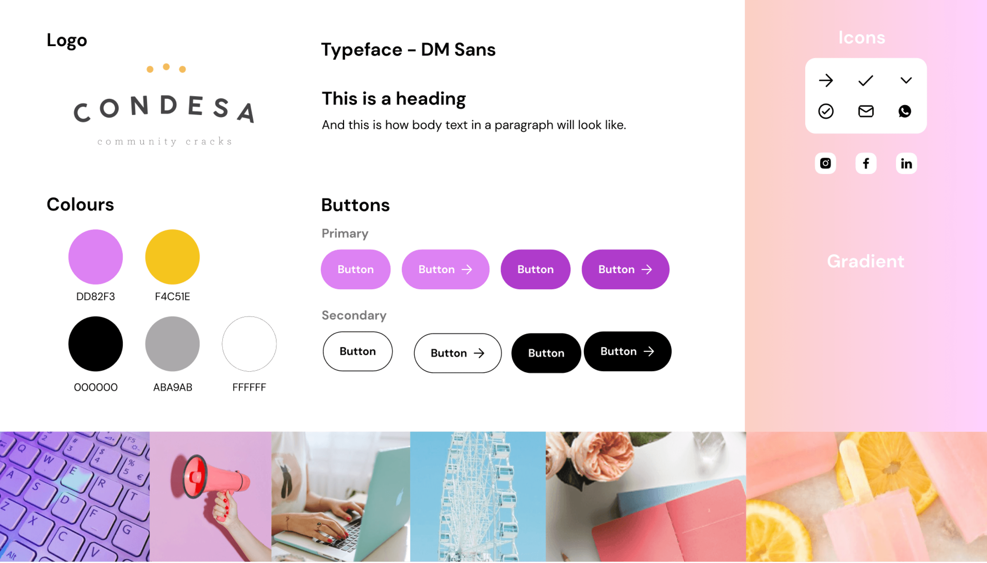
Style Tile
Style Tile
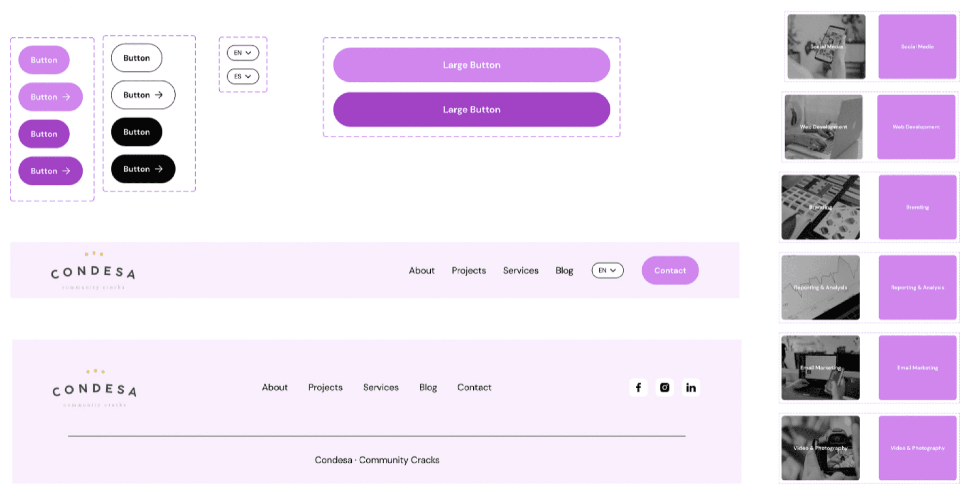
Components
Components
High-Fidelity & Prototype
High-Fidelity & Prototype
With all the previous steps properly completed, designing the High-Fi version was an great experience. Considering the time constraints, we decided to divide the work, assigning specific screens to each team member. Following the Design System, we crafted the designs, shared our results, made necessary adjustments and then started prototyping.
Before deciding which was the UI direction we were taking, we first created and tried different option. Here are some of them:
Initial High-Fi Designs
Initial High-Fi Designs
Following discussions and iterations, our team opted for a cleaner and more minimalistic approach. This process was both enjoyable and enlightening, involving all team members in sharing feedback and perspectives. Three main objectives guided our UI design, beyond the essential features prioritized through our MoSCoW method:
Creating a design that is intuitive to navigate and comprehends the prioritized “must-have” features.
Presenting an updated style to foster user trust is crucial for the agency’s credibility.
Balancing trendiness, youthfulness, creativity, and uniqueness with a display of professionalism and expertise.
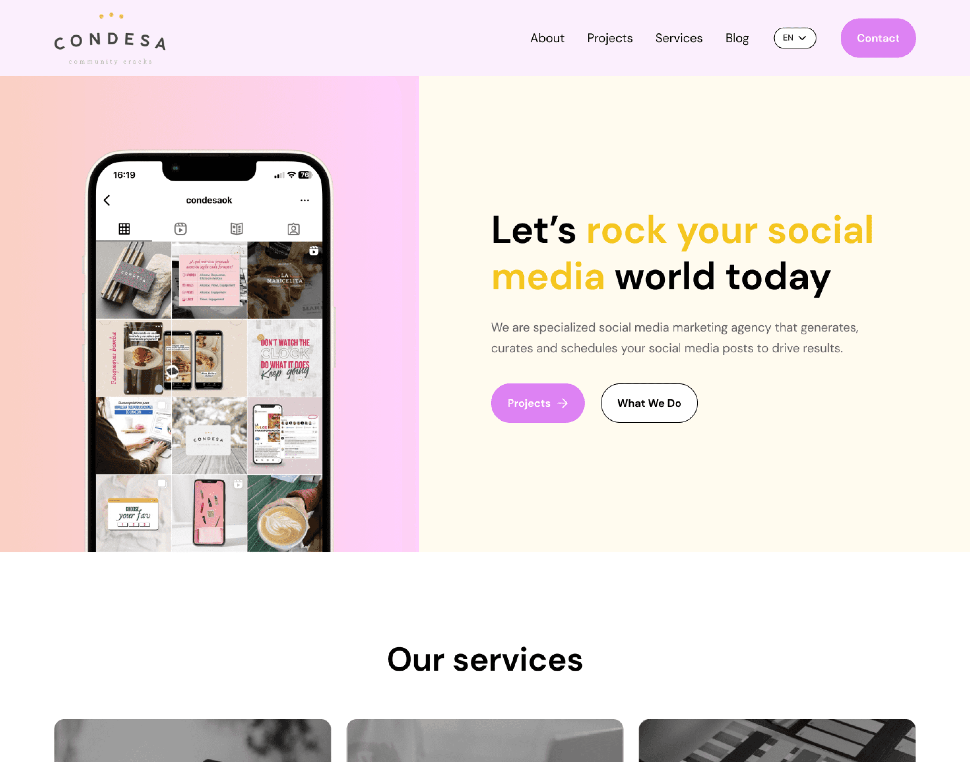
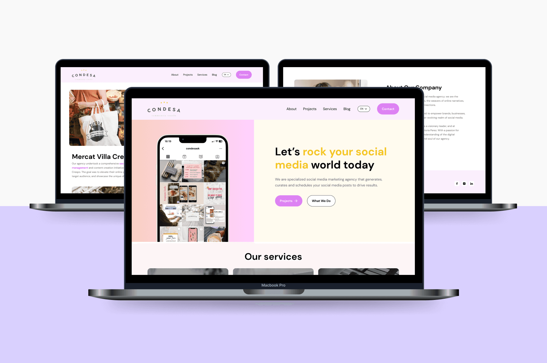
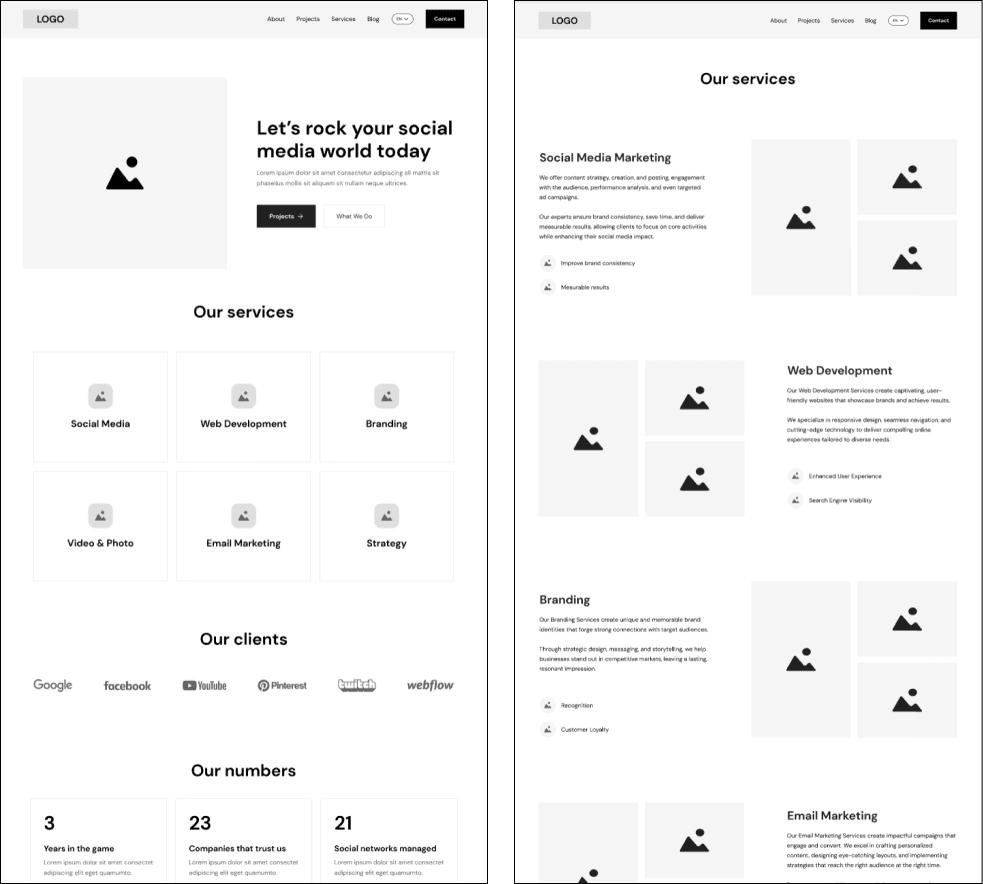
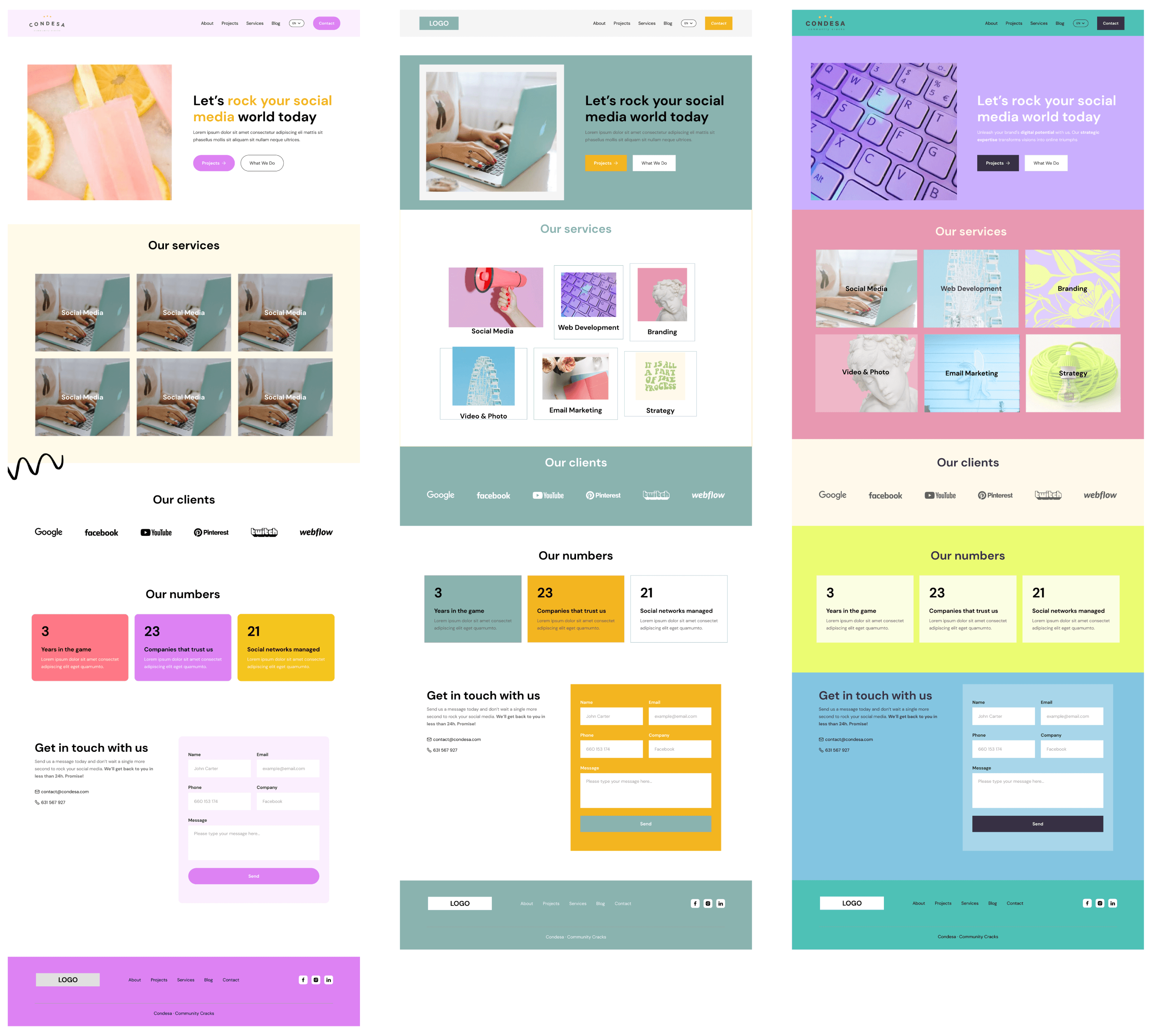
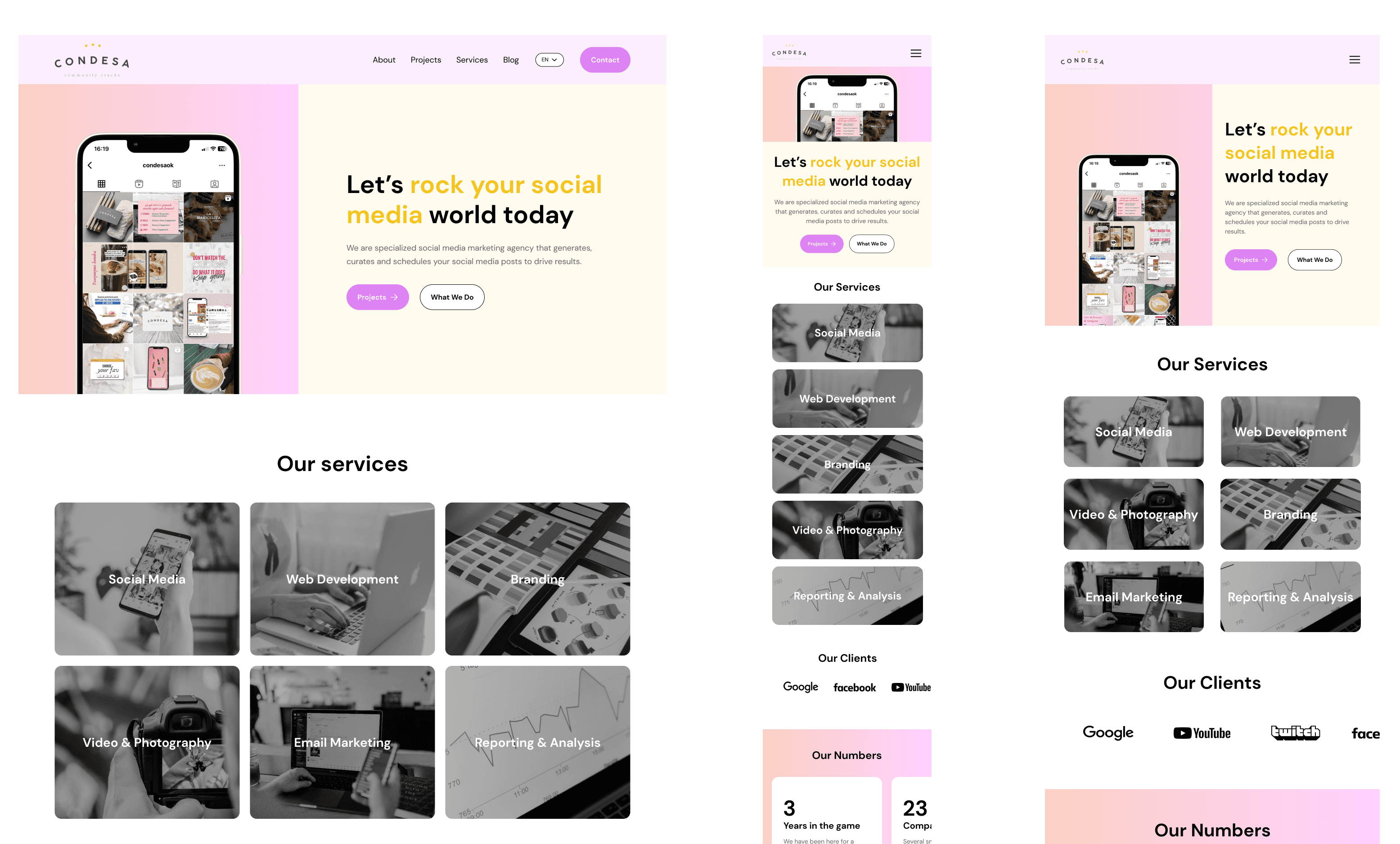
High-Fidelity Final Designs
High-Fidelity Final Designs
To ensure a seamless user experience across different devices, we prioritized responsive design. Our main adjustments included stacking services and project cards vertically, refining the hero section layout, and using a hamburger menu for navigation.
To ensure a seamless user experience across different devices, we prioritized responsive design. Our main adjustments included stacking services and project cards vertically, refining the hero section layout, and using a hamburger menu for navigation.
To ensure a seamless user experience across different devices, we prioritized responsive design. Our main adjustments included stacking services and project cards vertically, refining the hero section layout, and using a hamburger menu for navigation.
Conclusions
Conclusions
We have achieved our goal, although there are still many things to refine and improve. Throughout this journey, we have learned and enjoyed immensely. This project has been more than just hard work; it has been an amazing teamwork.
Considerating that to the Stakeholder, the UI was important and that we validate it during the interviews, here you can see the difference, and the deisgn evolution.
Design Evolution
Design Evolution
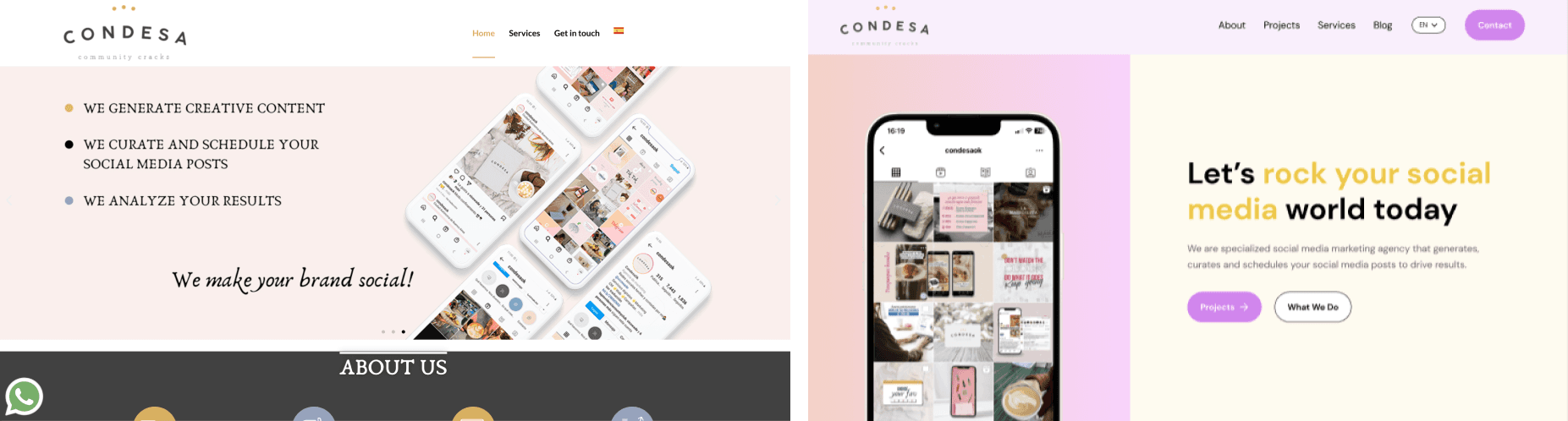
Web Design - Before and After our intervention
Web Design - Before and After our intervention
What´s next?
What´s next?
As we all know, there are always different ways to improve, and we are more than sure that keep on working on this web deisgn will bring even more benefits, not only to the users, but also to the business. We would love to:
Keep on improving the UI
Finish the responsive designs to apply it as soon as possible
How can Condesa mesure the success of these new web? There are some of the KPI´s we suggest:
Checking the traffic, how many users stayed, and navigate through the Projects and Services Section
Contact Rate
Conversion Rate
© Designed and created by Maro Borsani, 2023 - rosarioborsaniz@gmail.com
This portfolio was built with lots of love, effort, motivation, creativity, and music. Please treat it with care.
© Designed and created by Maro Borsani, 2023 - rosarioborsaniz@gmail.com
This portfolio was built with lots of love, effort, motivation, creativity, and music. Please treat it with care.
© Designed and created by Maro Borsani, 2023 - rosarioborsaniz@gmail.com
This portfolio was built with lots of love, effort, motivation, creativity, and music. Please treat it with care.